Project: From Concept to Identity
Brand: Roots Fitness
Role: Creative Lead
Date: 2016
Brand: Roots Fitness
Role: Creative Lead
Date: 2016
Objective: Create a distinctive brand identity for Roots Fitness, a San Antonio gym built on the belief that lasting strength begins with a solid foundation. The logo needed to capture the ideas of resilience, growth, and transformation by incorporating tree roots as a visual metaphor for progress that starts from the ground up.
Approach: To bring the client's vision to life, I developed a visual identity that balanced the strength and energy of fitness with the resilience and growth found in nature. Tree roots became the central metaphor, symbolizing the foundation from which lasting progress is built.
I explored a range of organic forms inspired by roots and branches, refining them into custom lettering that felt integrated rather than decorative. By weaving these natural elements directly into the typography, the logo communicates movement, connection, and growth while remaining bold and immediately recognizable. A distressed finish was introduced to add texture and authenticity, reinforcing the grit, perseverance, and hard work that define the fitness journey.
Throughout the design process, I carefully balanced strength with approachability, ensuring the identity felt welcoming without sacrificing impact. The final mark was refined for clarity, versatility, and scalability, allowing it to perform consistently across signage, apparel, merchandise, and digital applications.
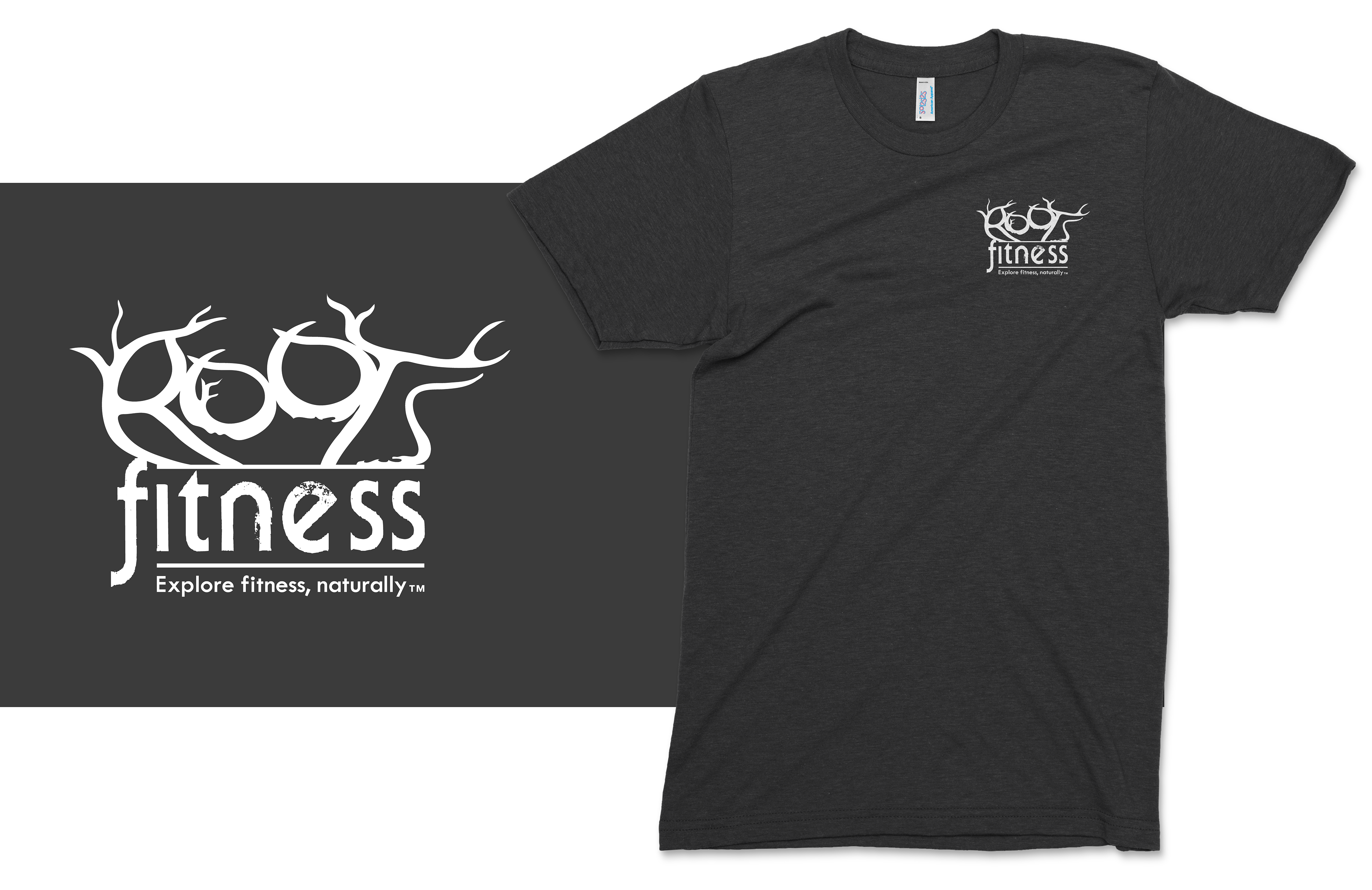
Impact: The completed logo was featured as a large scale mural inside the gym, becoming a focal point of the space. It was also applied across business cards, website, print collateral, and apparel, creating a cohesive visual identity that supports the brand’s mission to explore fitness naturally.

Need a logo for your brand or business?
Email me: sjmoecker@gmail.com
Email me: sjmoecker@gmail.com
I'd love to hear your vision!