Company Overview
Euphoria Threads is a gender-free clothing brand founded in 2023. As the founder and creative lead, I oversee everything from strategic direction to design, product development, and daily operations. In 2024, I led a transformative rebranding to better align the visual identity with our core mission: to empower and uplift the LGBTQIA+ community by spreading positivity, celebrating authenticity, and giving back.
Building Euphoria Threads has allowed me to apply creative leadership, brand strategy, and operational decision-making in a real-world environment, skills I bring into collaborative team settings and larger organizational contexts.
Brand Development
Objective: To shape the brand into a mission-driven identity that uplifts queer and trans communities through inclusive design, strategic visual identity, and a cohesive ecosystem that scales with impact.
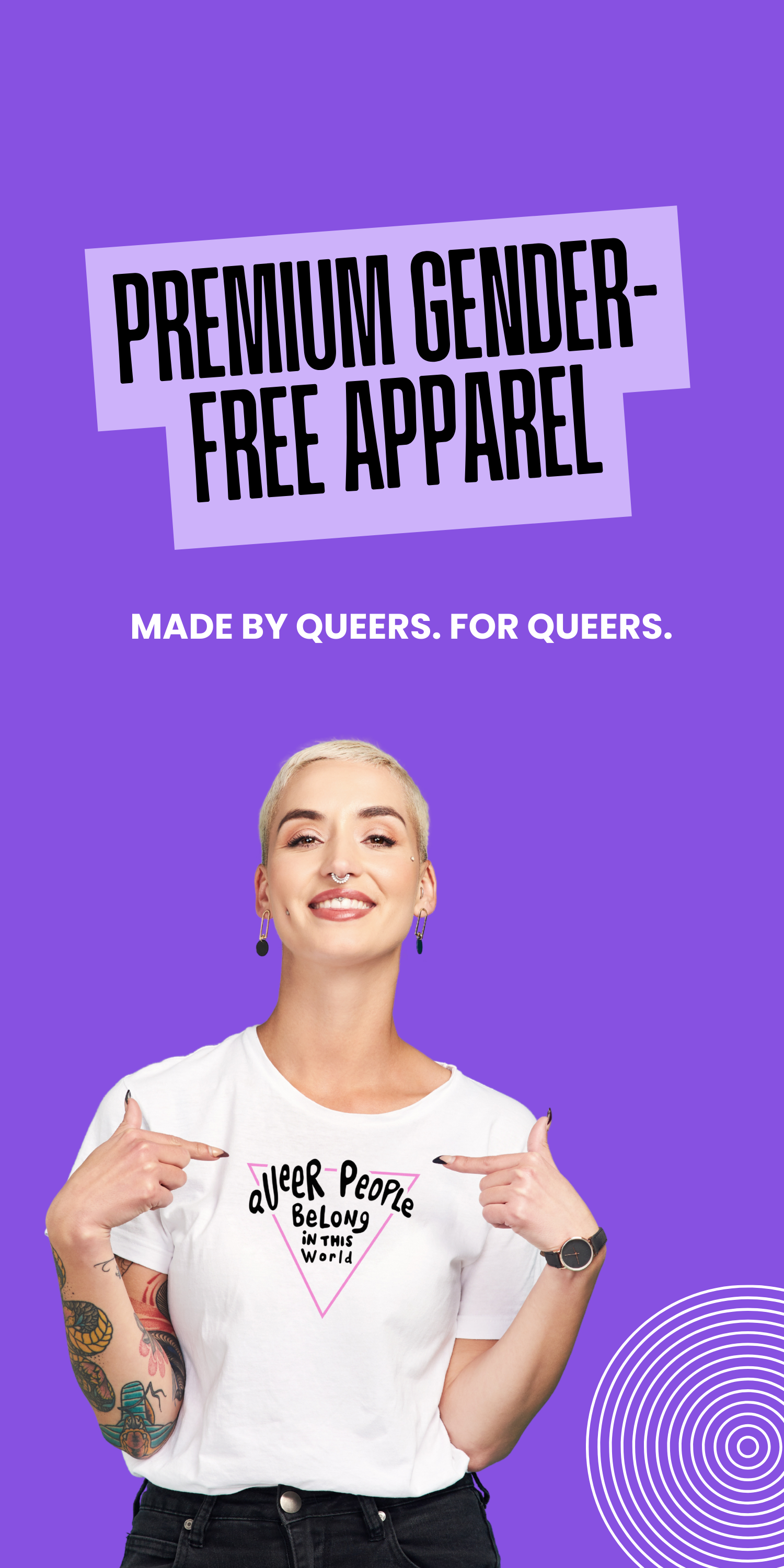
We aim to uplift and support LGBTQIA+ communities, including Two-Spirit, trans, nonbinary, and gender-expansive people. This focus guided the definition of the brand’s mission, values, and voice; clarified the community it serves; and shaped a recognizable visual language.
From naming and messaging to logo systems, apparel graphics, packaging, and digital presence, I developed each layer of the brand to ensure consistency, emotional connection, and long-term scalability.
From naming and messaging to logo systems, apparel graphics, packaging, and digital presence, I developed each layer of the brand to ensure consistency, emotional connection, and long-term scalability.
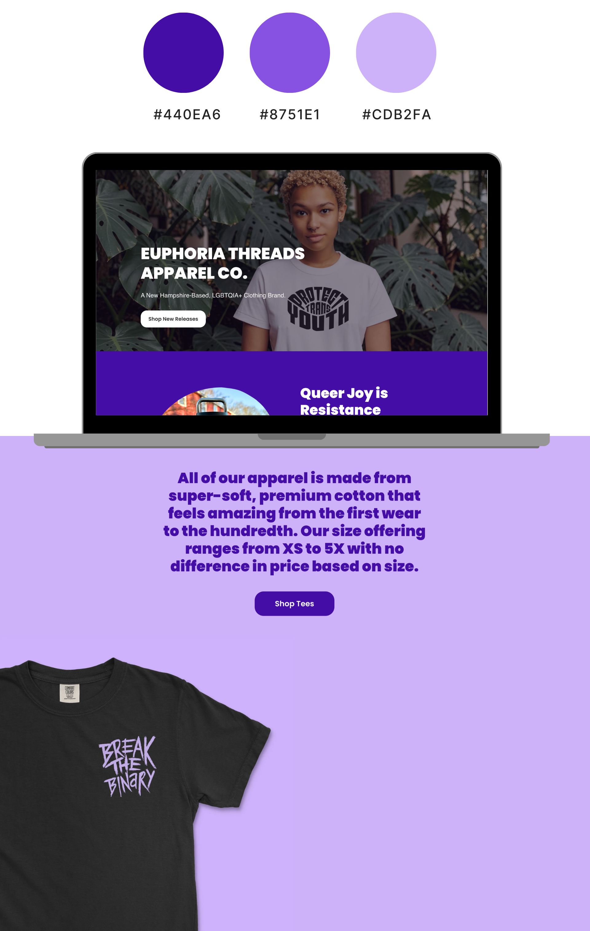
Color System
The color system was designed to balance emotional resonance, accessibility, and versatility across apparel, print, and digital touchpoints.
Primary Colors
Deep Purple (#440EA6): Modern, polished, and timeless aesthetic. A strong, neutral anchor that balances the bright colors in the palette.
Vibrant Purple (#8751E1): Creativity, uniqueness, and joy. Embodies confidence and empowerment. Strong, regal, and grounding (historically tied to LGBTQ+ pride).
Lavender (#CDB2FA): Evokes creativity, inclusivity, and self-expression. Soft, calming, and gender-expansive (often associated with queer aesthetics).
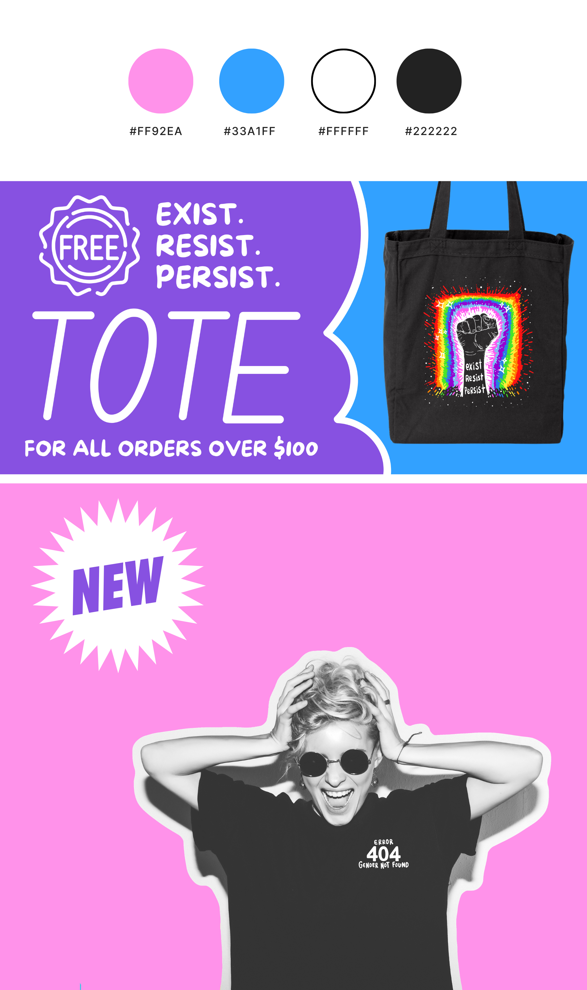
Secondary Colors
Bubblegum Pink (#FF92EA): Playful, energetic pink that radiates joy, celebration, and pride. Bold and energetic, adding vibrancy.
Vibrant Blue (#33A1FF): Fresh, uplifting, and full of possibility. Trust, creativity, and freedom, evoking open skies and a sense of optimism.
White (#FFFFFF): Purity, simplicity, clarity, and openness. Provides a sense of balance, allowing other colors to stand out while also evoking feelings of inclusivity, peace, and possibility.
Charcoal Black (#222222): Modern, polished, and timeless aesthetic. A strong, neutral anchor that balances the bright colors in the palette.
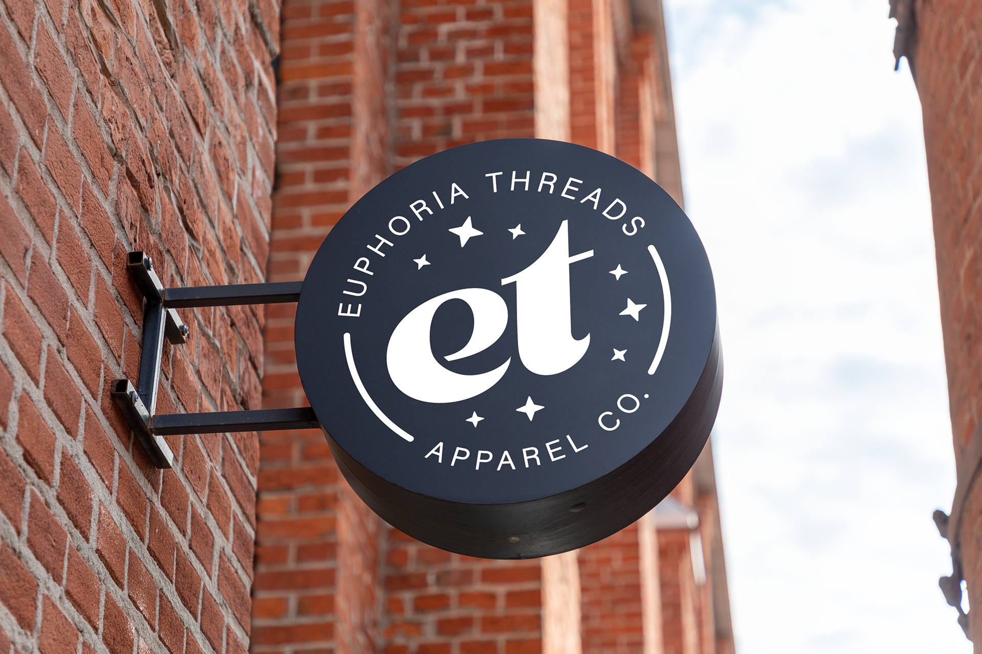
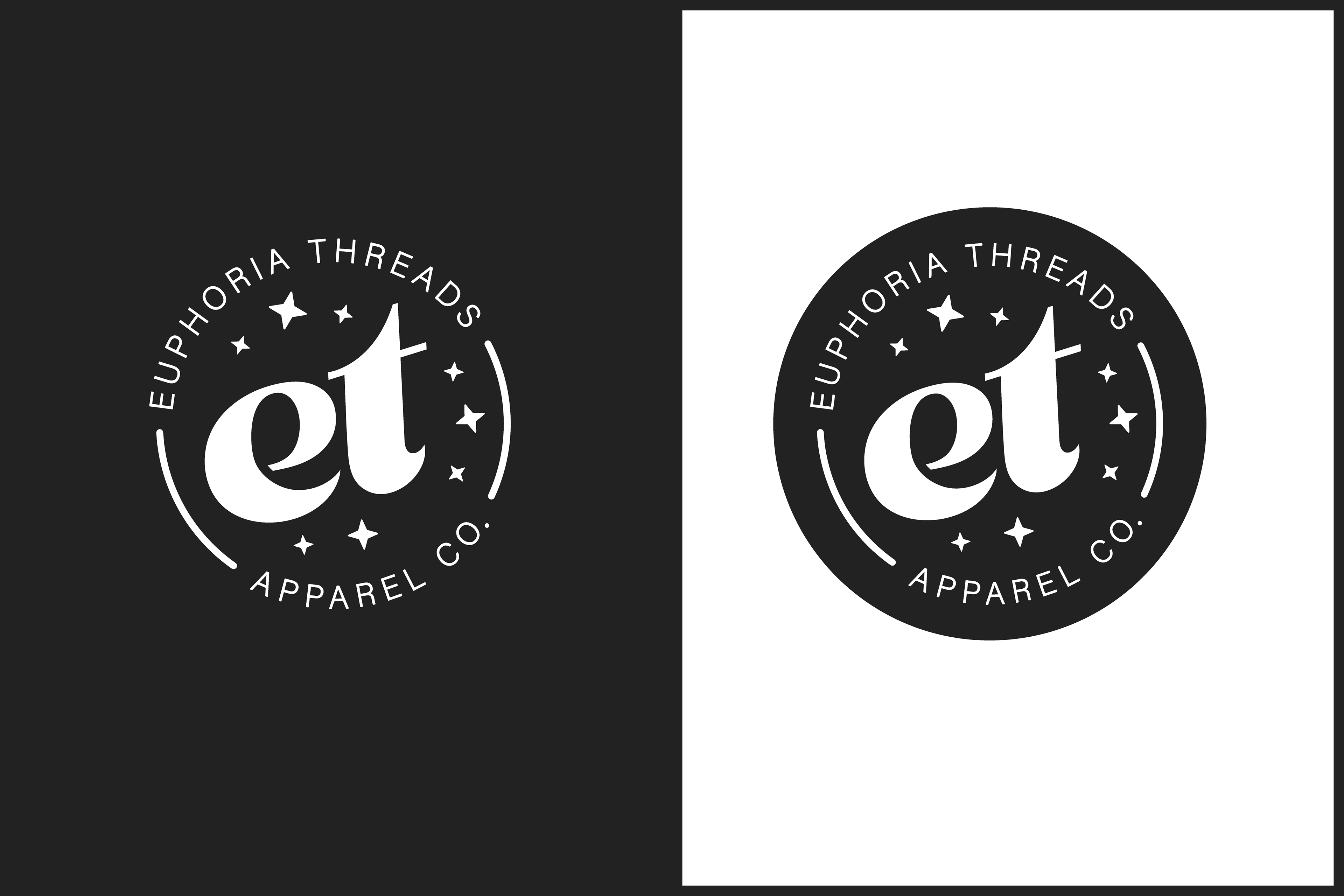
Logo Redesign, 2024
The brand underwent a transformative rebranding to better reflect the brand's core mission: uplifting and empowering the LGBTQIA+ community. While the original logo had a clean, minimalist style, it didn’t fully capture the essence of our brand.
Objective: Redesign logo to better align with mission that captures the brand's uplifting and empowering energy.
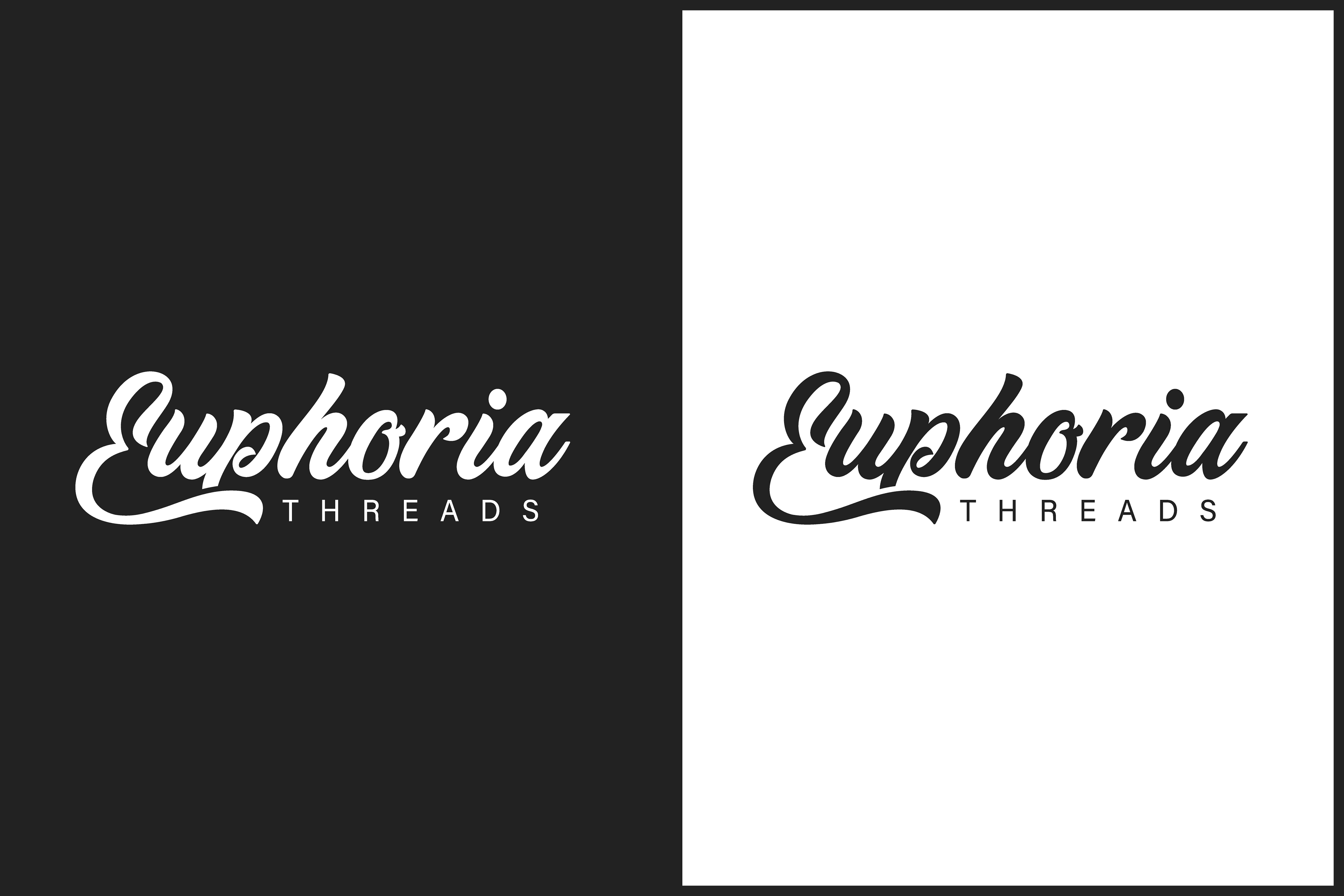
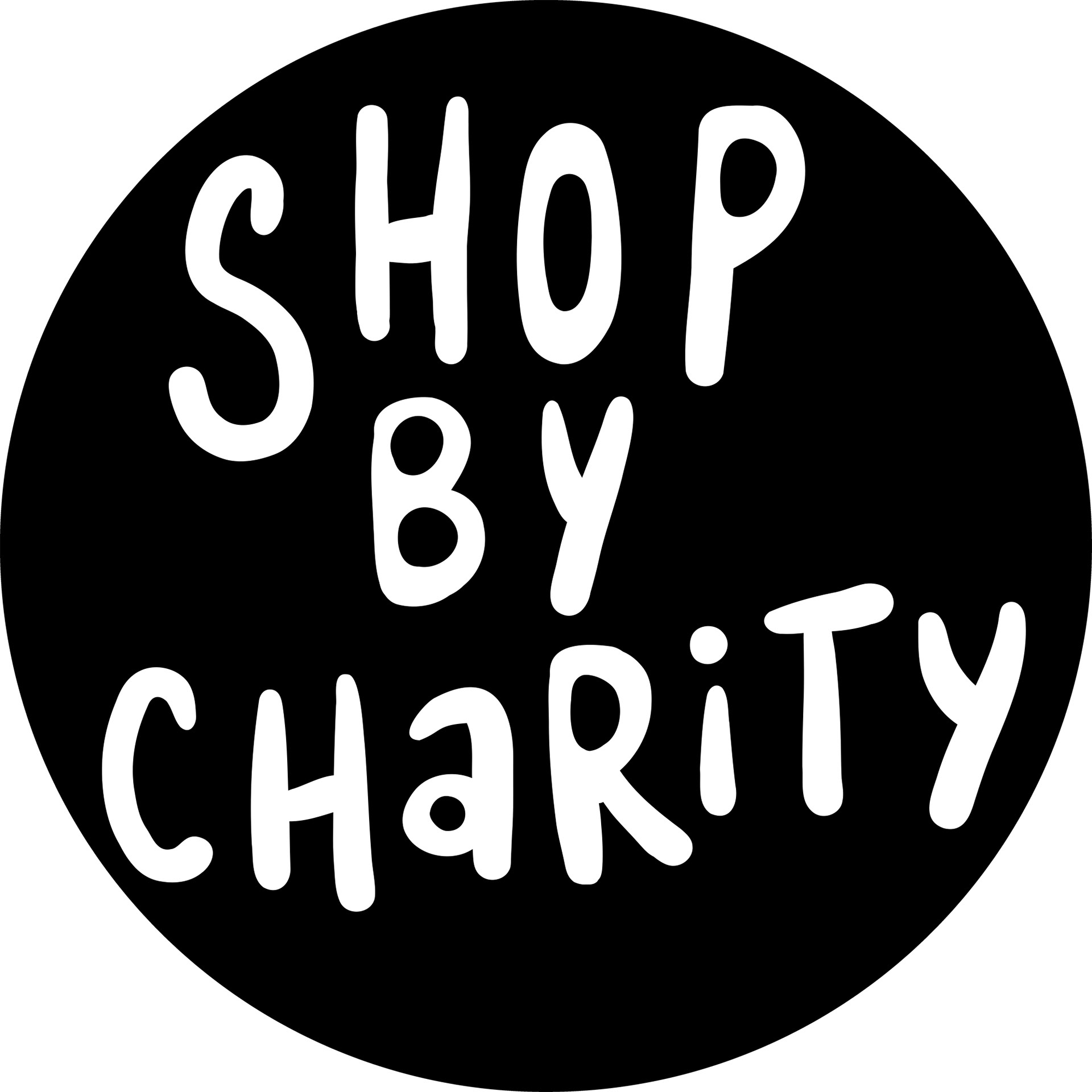
ORIGINAL LOGO | 2023
Logo Concept & Visual Direction
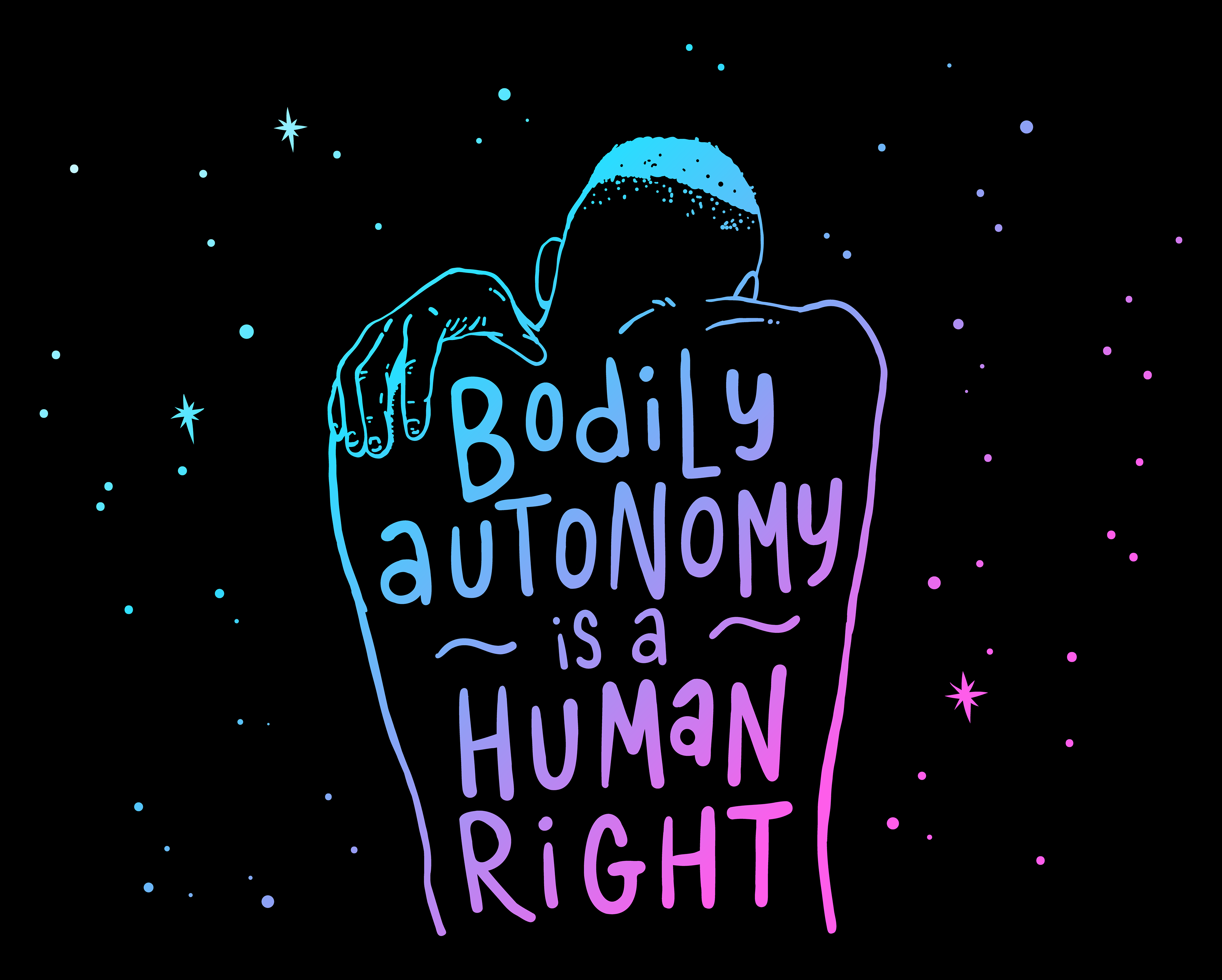
The new logo was designed to evoke a sense of euphoria while maintaining a clean and modern aesthetic. The circular composition reinforces unity and wholeness, while the surrounding stars symbolize limitless possibilities, queer and trans joy, and the magic of self-discovery.
Inspired by a calm night sky, which is a recurring theme in the brand's illustrations and product designs, the logo captures a sense of wonder and empowerment. The curved lines and balanced typography create a bold yet welcoming feel, aligning with the brand’s mission to uplift and empower the community through gender-free apparel and accessories.
NEW LOGO | 2024
Brand Touchpoints
Our empowering message carries through to our print materials and tagless garment labels, creating a joyful and affirming brand experience from the moment a package arrives to the moment a garment is worn. These shipment inserts reflect our playful brand voice with bold typography, vibrant color palettes, and clear layout hierarchy to balance visual impact with function. From the thank-you note on the front to the discount offer on the back, every element reinforces connection, joy, and customer appreciation while encouraging engagement and repeat purchases.
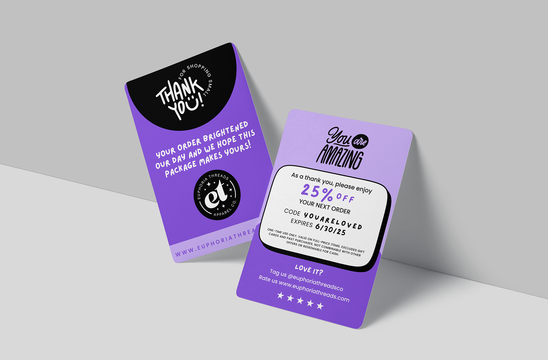
PACKAGING INSERT CARDS | 2025
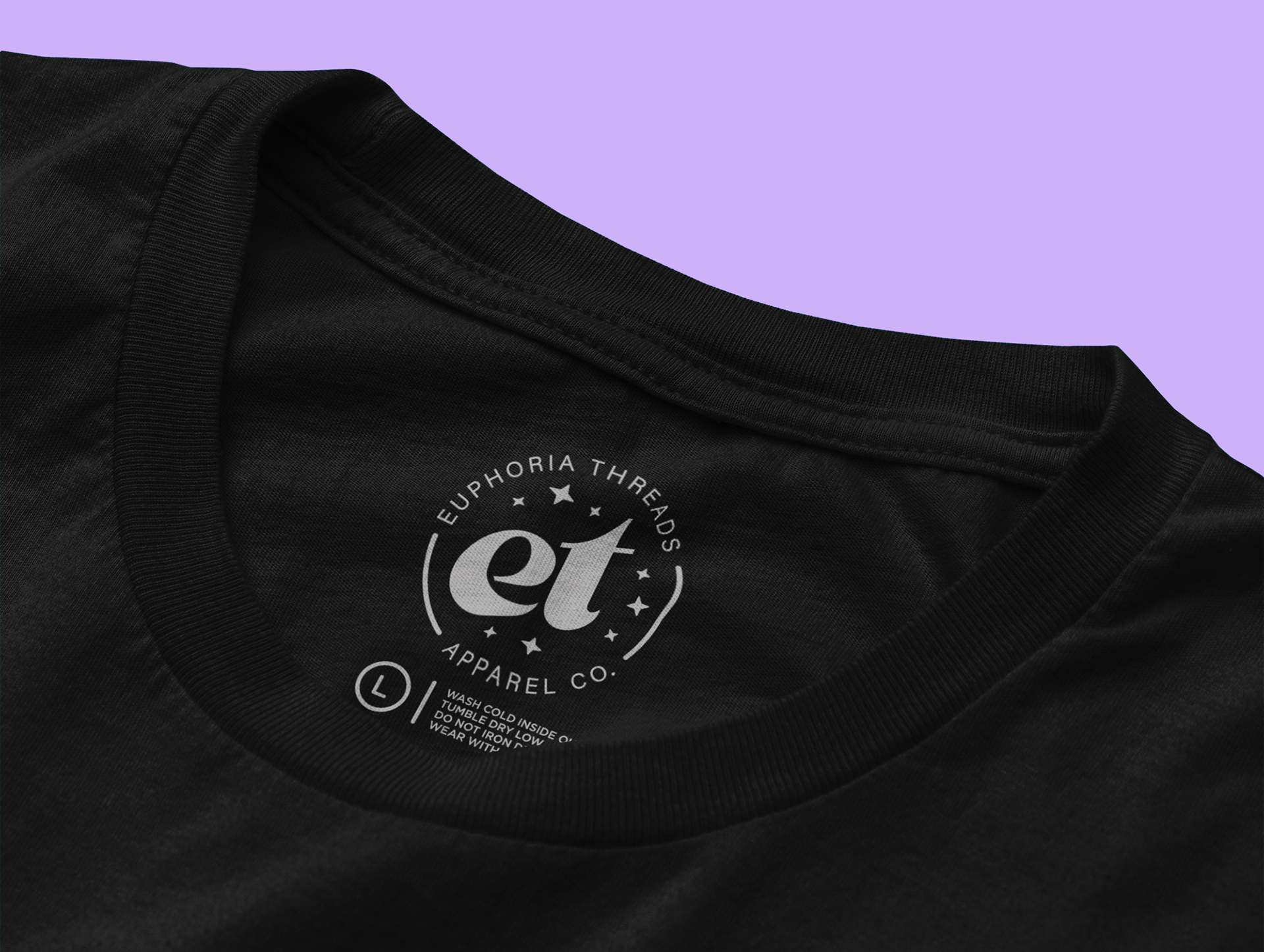
TAGLESS LABELS | 2024
Impact
The rebrand clarified the company’s mission and visual identity, strengthened community engagement, and created a flexible brand system that supports new product launches, campaigns, and partnerships while staying rooted in purpose.
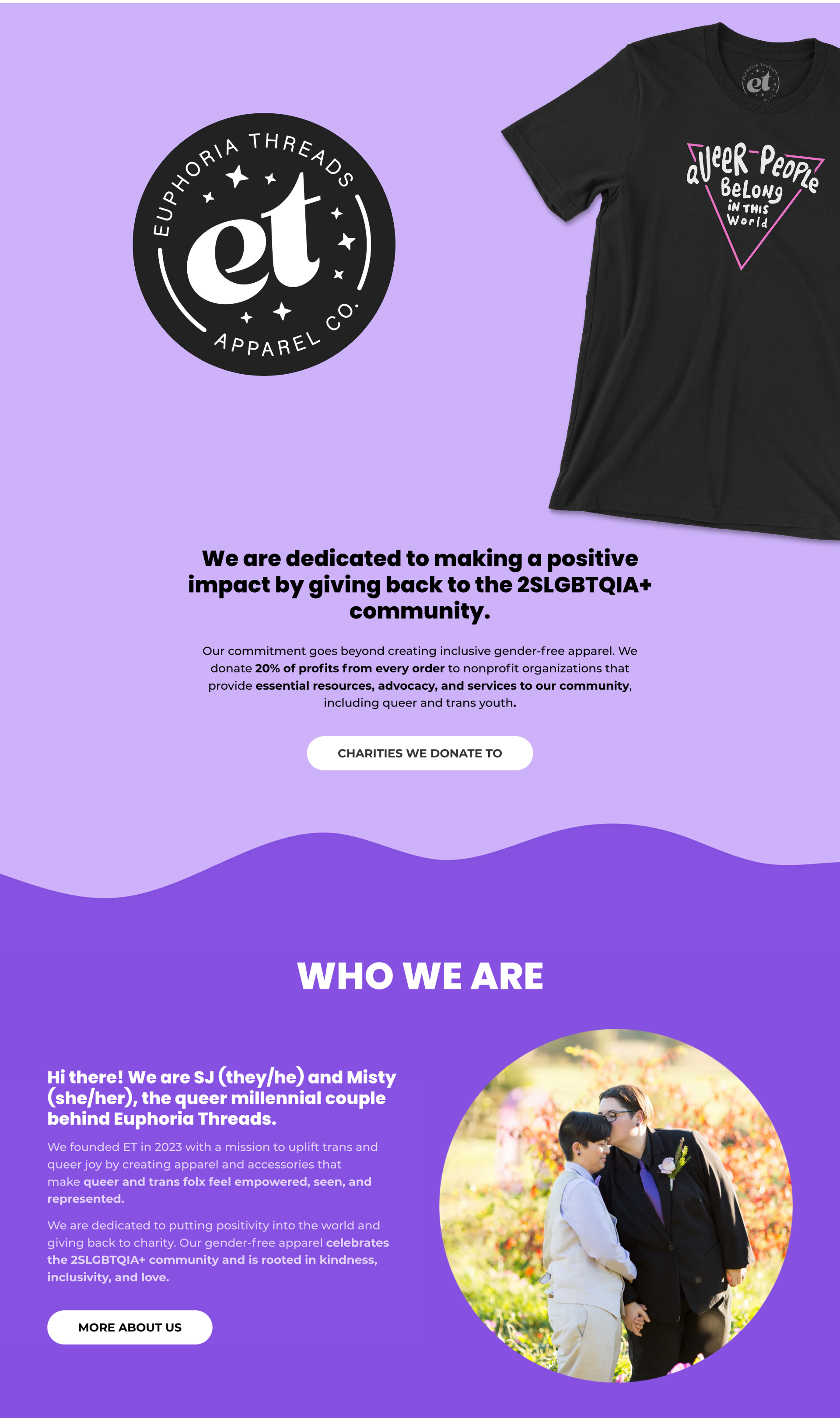
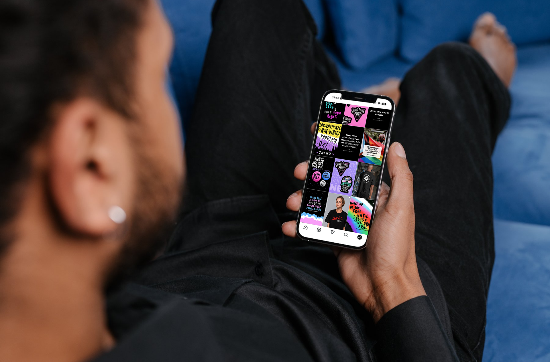
Community Connection
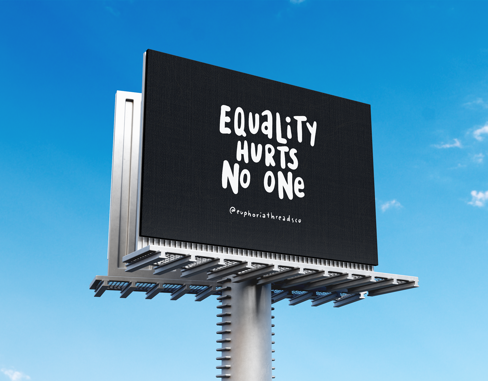
Our social media channels, products, and campaigns are designed to uplift, spark conversations, and inspire action in the fight for justice. Every decision we make, from design to digital engagement, is rooted in fostering a sense of belonging and strength, ensuring queer and trans folx feel seen and empowered.
Hand-drawn Social Icons
I created a set of hand-drawn Instagram highlight icons to carry the brand’s illustration style into its social presence. The icons echo the same imperfect linework, playful curves, and human touch found in the brand’s artwork, creating a cohesive visual system across posts, highlights, and stories. This small but intentional detail reinforces brand consistency and makes the profile feel thoughtfully designed from top to bottom.
Social Media to Product Pipeline
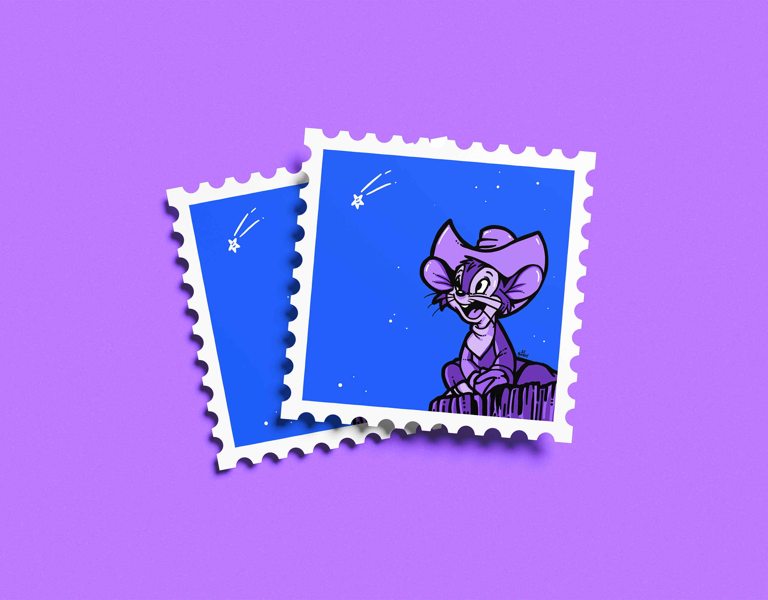
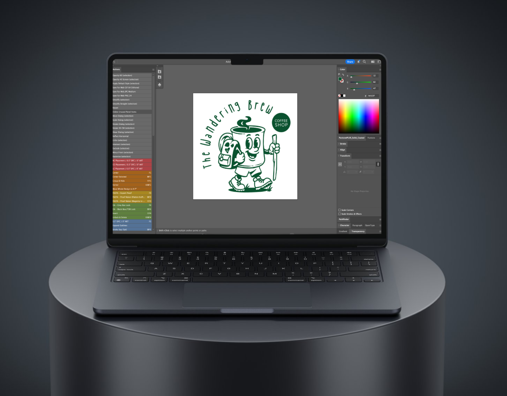
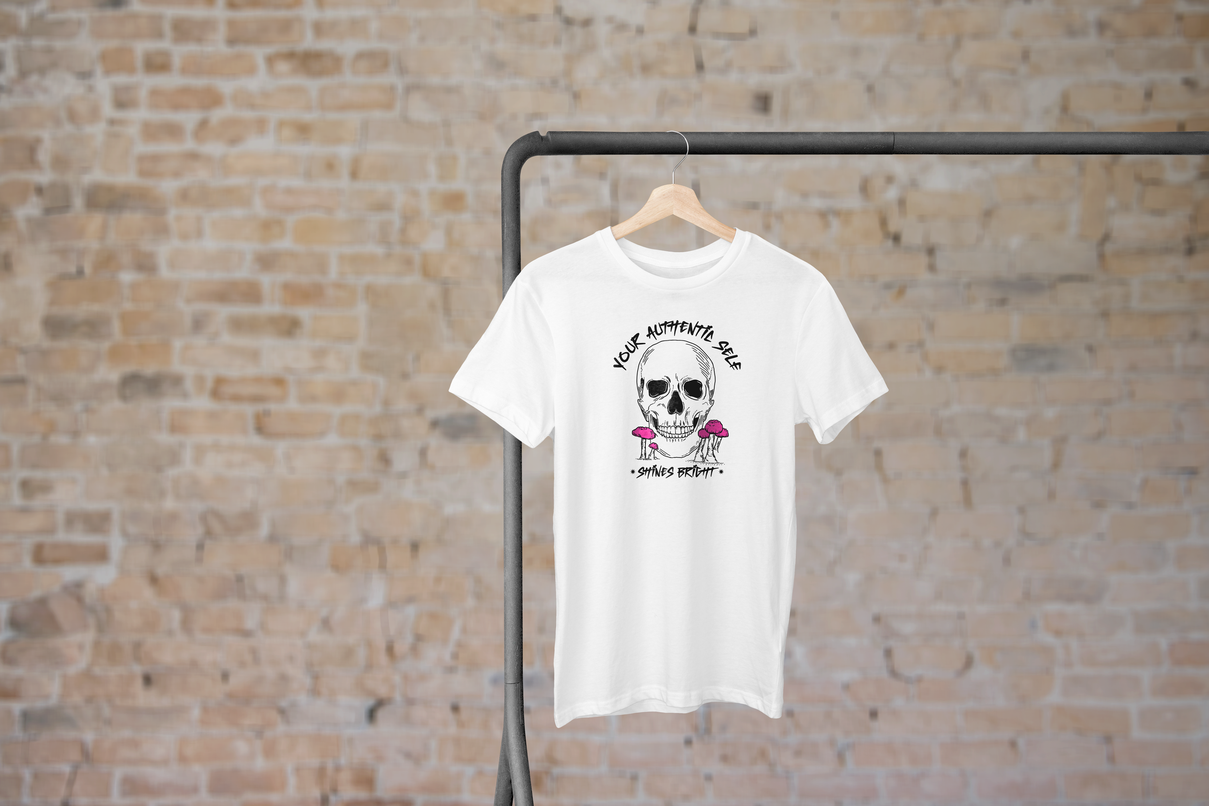
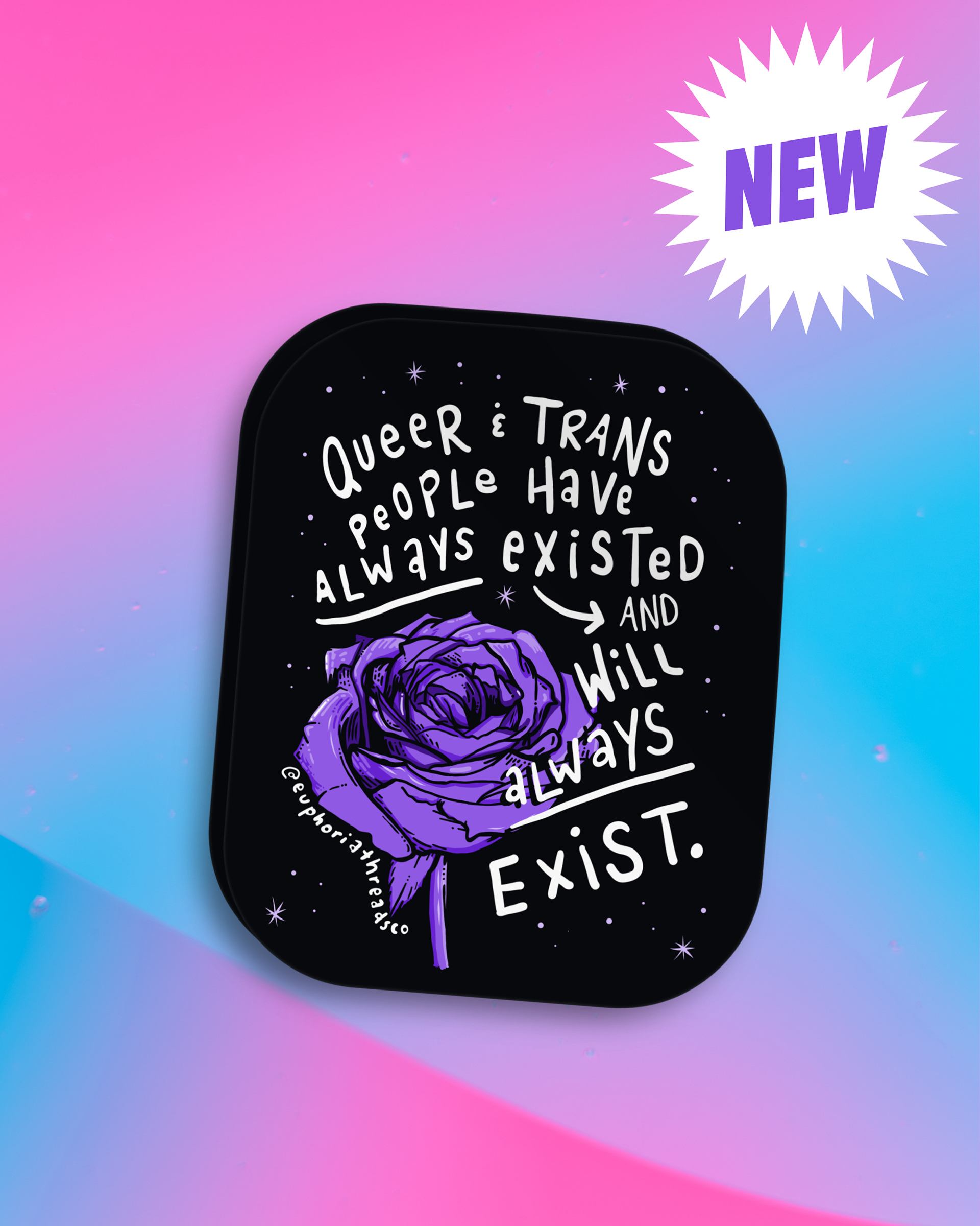
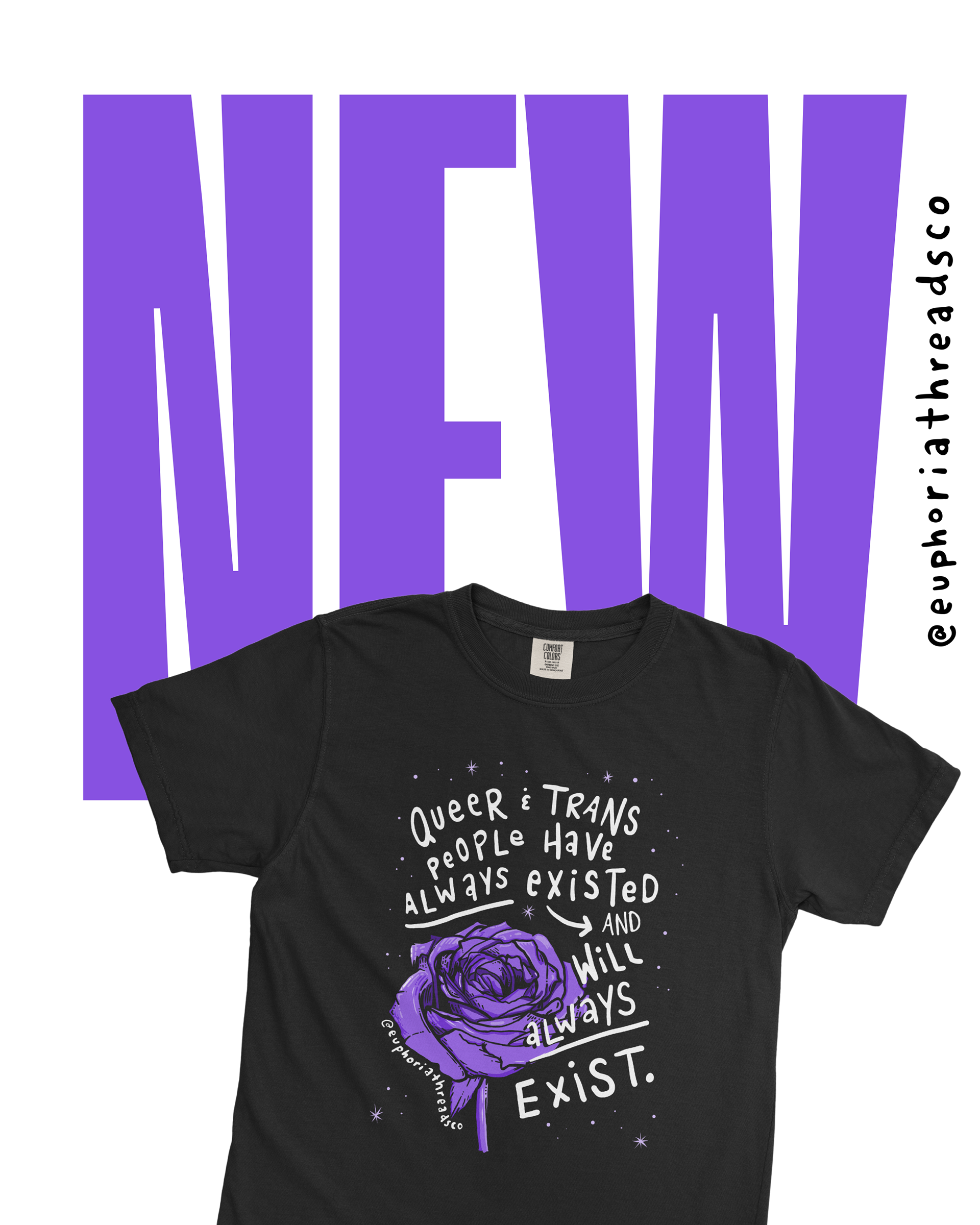
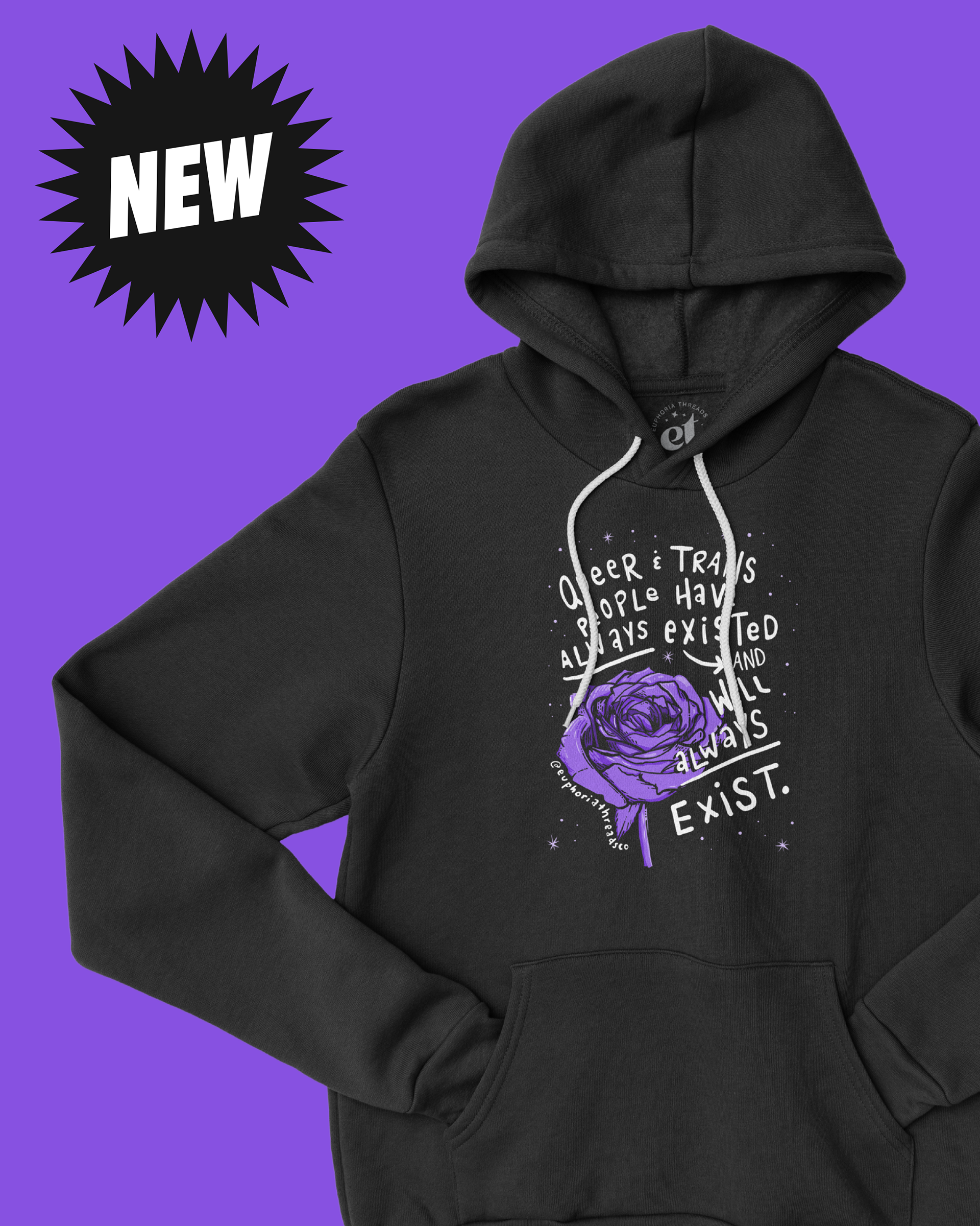
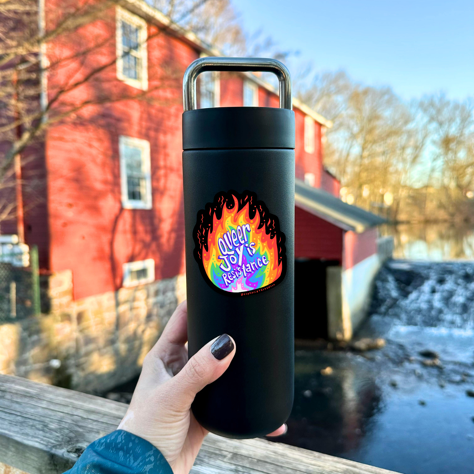
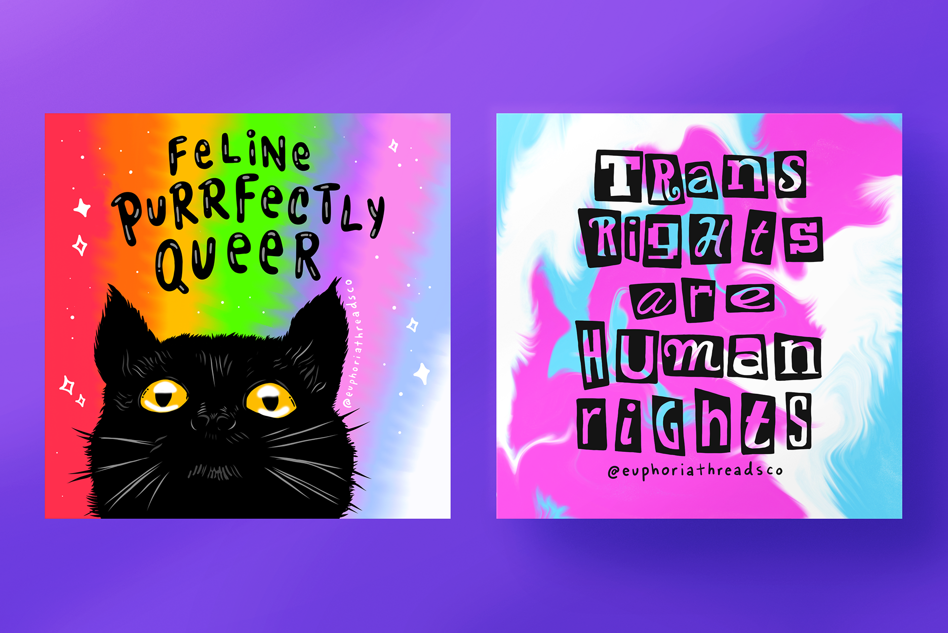
At Euphoria Threads, we take a community-driven approach to product design. Our original illustrations are first introduced on social media, allowing us to engage directly with our community and gauge interest. This process fosters connection and ensures our designs resonate with the LGBTQIA+ community.
Once an illustration gains traction and positive feedback, we develop it into apparel and accessories, transforming digital art into wearable affirmations that support LGBTQIA+ visibility. This approach ensures that every product we create is not just visually compelling but also meaningful to those who wear it.
E-commerce Website Design
I designed and developed the Euphoria Threads website from the ground up, guiding a full rebrand and continuing to evolve the site through ongoing updates. The experience was intentionally crafted to feel affirming, accessible, and welcoming, translating the brand’s community-driven mission into a clear and engaging digital space that supports both community connection and business sustainability.
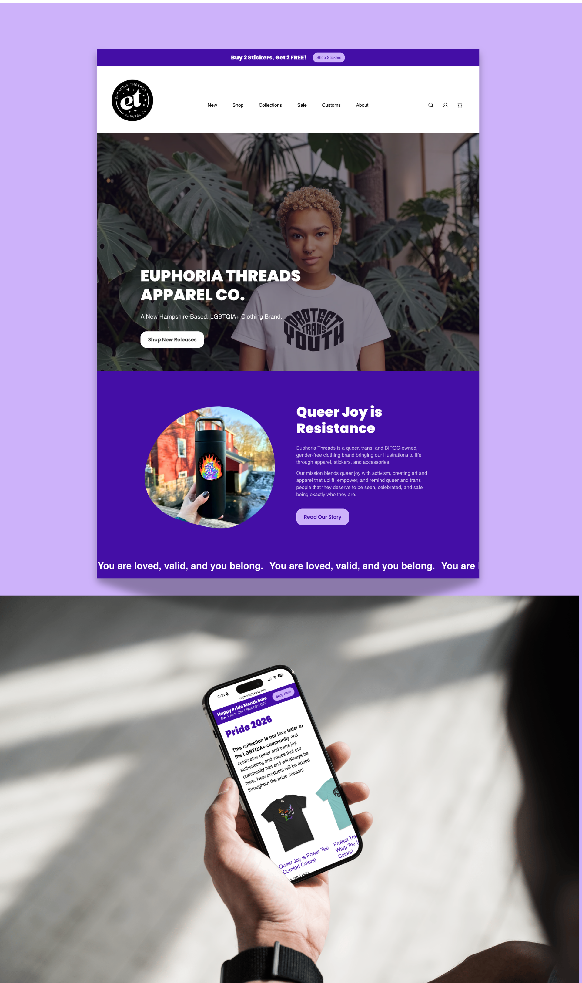
I built a fully responsive, mobile-optimized layout on Shopify, designed for ease of navigation and performance. The shopping experience was developed with intentional typography, color palettes, and inclusive language to reflect the brand’s identity. I created all visual assets, including custom photography, illustrations, and promotional graphics. A user-friendly navigation system and intuitive filtering were implemented to support seamless product discovery
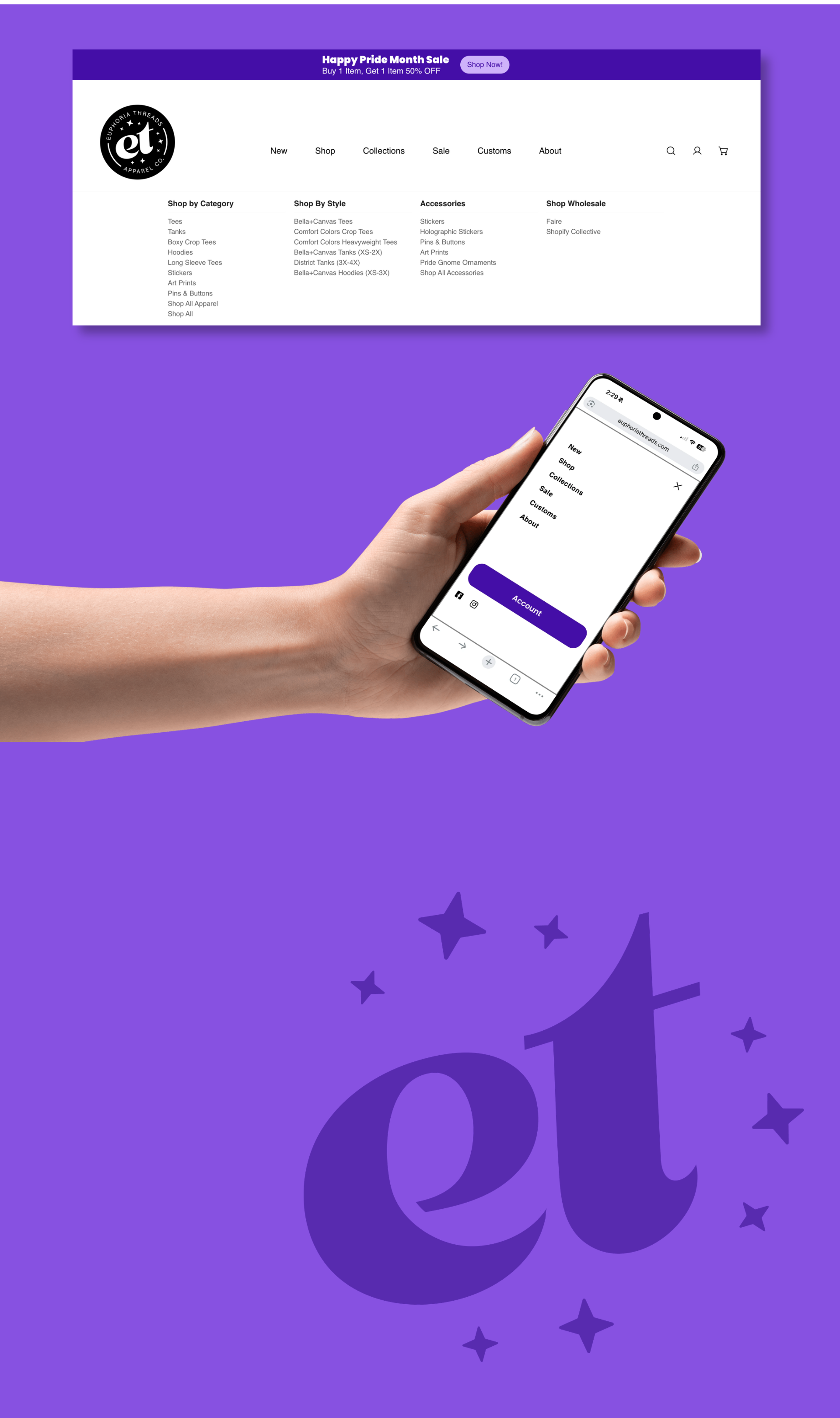
I oversee the website as a core brand platform, supporting seasonal product drops, homepage refreshes, and storytelling tied to community impact. I guide ongoing evolution across content, user experience, SEO, and performance, ensuring the site aligns with both brand vision and business goals. The result is a clean, modern structure infused with retro warmth and a bold, empowering tone that strengthens engagement and reinforces brand purpose.
Promotional Banners for Web & Email

Creative Leadership
Building and evolving Euphoria Threads continues to shape how I approach creative leadership, reinforcing the importance of clarity, inclusion, and systems that grow with both people and purpose.
Curious to see how Euphoria Threads
is making an impact? Check out our campaigns.
is making an impact? Check out our campaigns.
Want to see more illustrations?
Follow @euphoriathreadsco
Shop www.euphoriathreads.com
Shop www.euphoriathreads.com
Interested in collaborating on a project?
Email me: sjmoecker@gmail.com
Email me: sjmoecker@gmail.com
I'd love to hear your idea!